Bayesian multivariable linear regression in PyMC3
A motivating example for Sklearn users interested in Bayesian analysis
Bayesian linear regression (BLR) is a powerful tool for statistical analysis. BLR models can provide a probability density of parameter values as opposed to a single best-fit value as in the standard (Frequentist) linear regression. In addition, BLR can be used to fit to parameters within a specified interval or create hierarchical models. However, despite decades of development and open source libraries, BLR has yet to reach its full user base potential. One key obstacle to this is overcoming the barrier to entry for new users. In this blog post I hope to remove some of these obstacles by demonstrating how to:
- Create a model
- Train a model
- Create a traceplot and summary statistics
- Run the model on test data
Create the data
In this first step, the necessary libraries are imported and the data set is created. PyMC3 is the Bayesian analysis library and Theano is the back-end of PyMC3 handling vector/matrix multiplication. Theano is necessary to import in order to create shared variables that can be used to switch out the test and train data.
In this example, the data set has only two features and 1000 data points. However, these values can be changed through the num_features and data_points attributes. The variables beta_set and alpha_set are the slopes and intercept, respectively, that we will try to guess later.
The variables X and y are created using the slope and intercept values and normally distributed random noise is added to Y. Finally, X and y are split into training and testing set via Sci-kit learn’s train_test_split function.
In [1]:
# create the data set
import pymc3 as pm
import numpy as np
import pandas as pd
import matplotlib.pyplot as plt
import theano
from sklearn.model_selection import train_test_split
from sklearn.metrics import r2_score
plt.style.use('seaborn-darkgrid')

num_features = 2
data_points = 1000
beta_set = 2.*np.random.normal(size=num_features)
alpha_set = np.random.normal(size=1)

X = np.random.normal(size=(data_points, num_features))
y = alpha_set + np.sum(beta_set*X, axis=1) + np.random.normal(size=(data_points))
X_train, X_test, y_train, y_test = train_test_split(X, y, test_size=0.33, random_state=42)
Plot the data set
Next, let’s visualize the data we are fitting. The feature X1 shows a postive correlation, whereas X2 shows a negative correlation.
In [4]:
plt.scatter(X_train[:,0], y_train, c='r', label='X1')
plt.scatter(X_train[:,1], y_train, c='b', label='X2')
plt.xlabel('X')
plt.ylabel('Y')
plt.legend()
plt.show()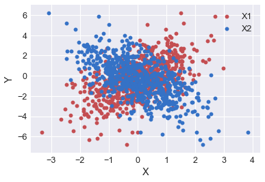
Create the PyMC3 model
Next, we create the PyMC3 model. In PyMC3 all model parameters are attached to a PyMC3 Model object, instantiated with pm.Model. Next, we declare the Theano shared variables, one for the input and one for the output. Model parameters are contained inside the with section. Alpha is the prior distribution for the intercept. Beta is the prior distribution for the slopes, with dimension described by the number of features. S is the prior distribution describing the noise around the data. Data_est is the expected form or model of the data. Finally, y is likelihood.
In [4]:
lin_reg_model = pm.Model()  #instantiate the pymc3 model object

#Create a shared theano variable. This allows the model to be created using the X_train/y_train data
# and then test with the X_test/y_test data
model_input = theano.shared(X_train)
model_output = theano.shared(y_train)

with lin_reg_model:
    alpha = pm.Normal('alpha', mu=0, sd=1, shape= (1)) # create random variable alpha of shape 1
    beta = pm.Normal('betas', mu=0, sd=1, shape=(1,num_features)) # create random variable beta of shape 1,num_features

    s = pm.HalfNormal('s', sd=1)  # create distribution to describe noise in the data

    data_est = alpha + theano.tensor.dot(beta, model_input.T)  # Expected value of outcome

    y = pm.Normal('y', mu=data_est, sd=s, observed=y_train)  # Likelihood (sampling distribution) of observations
It is often difficult to visualize the model from the several lines of code above. When first building a model, it is helpful to draw out your design as shown below.
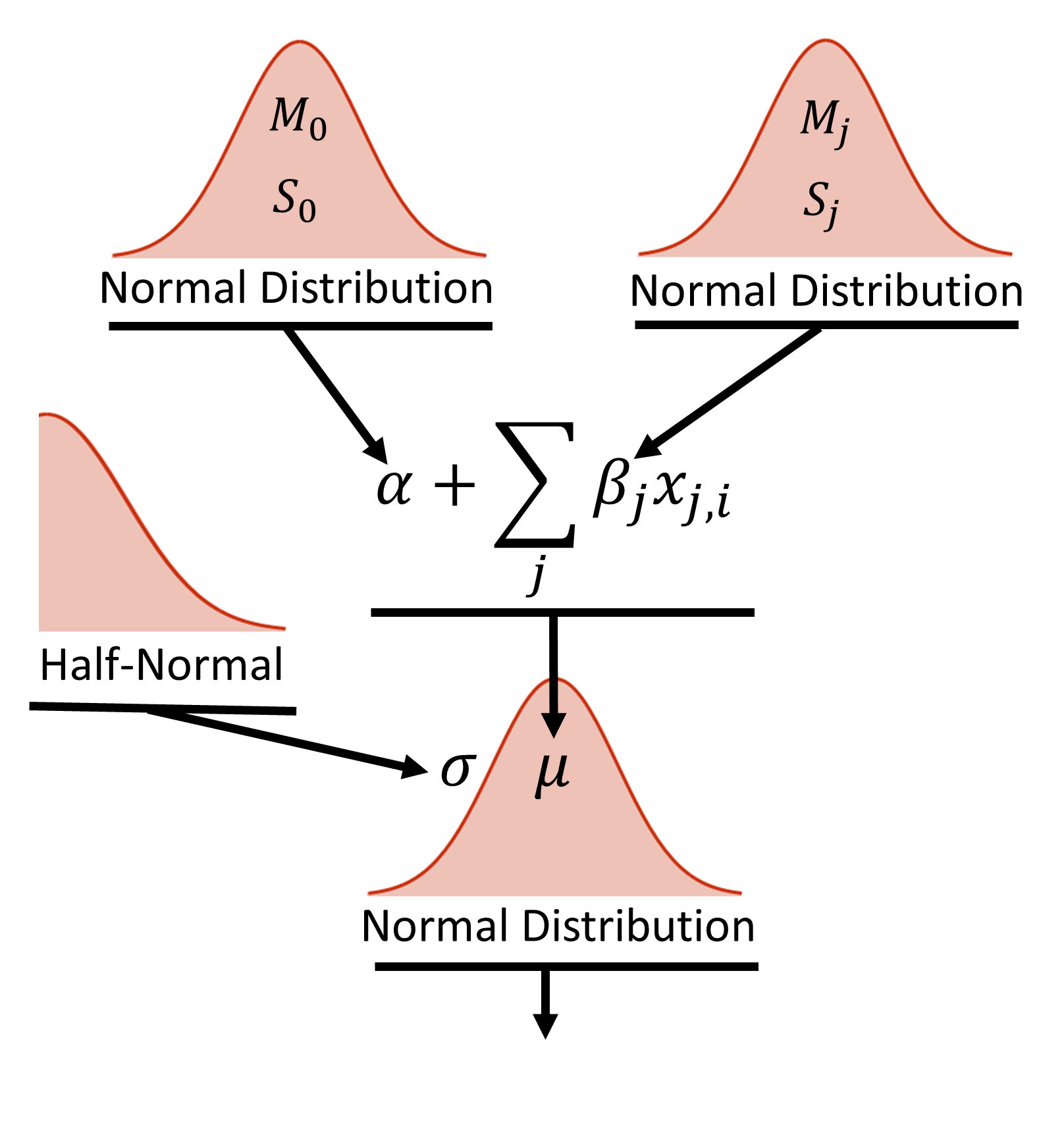
Figure 2, shows the hierarchical diagram of the model. At the base of the model is the datum, yi, which is normally distributed random value with a mean value, μi and width σ. The width is described by a half-normal distribution. The mean value is described by the equation shown above, where the intercept (α) and slope (β) are both given broad normal priors that are vague compared to the scale of the data. Each feature has it’s own slope coefficients described by the normal prior.
Train the model
Next, we train the model. In this example we use the NUTS (No U-Turn sampler) method as the stepper. The pm.sample command draws samples from the posterior.
In [5]:
with lin_reg_model:
    step = pm.NUTS()
    nuts_trace = pm.sample(2000, step, njobs=1)
Sequential sampling (2 chains in 1 job)
NUTS: [s, betas, alpha]
100%|█████████████████████████████████████████████████████████████████████████████| 2500/2500 [00:05<00:00, 432.98it/s]
100%|█████████████████████████████████████████████████████████████████████████████| 2500/2500 [00:02<00:00, 836.41it/s]
traceplot and summary statistics
Once the model has completed training, we can plot the traceplot and look at summary statistics. The left column shows the posterior distributions for Alpha, Beta, and the standard deviation of the noise in the model. From these graphs, we get not only the mean value of the estimate, but the entire probability distribution. This is in effect what makes probablistic programming and Bayesian analysis unique and in many cases superior to frequentist statistics. The right column shows the sampling values for each parameter at each step.
In [6]:
pm.traceplot(nuts_trace)
plt.show()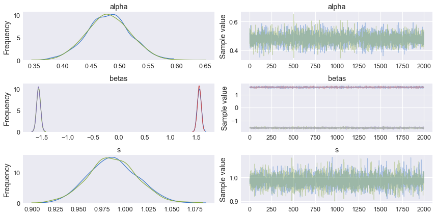
In [7]:
pm.summary(nuts_trace[1000:])The summary statistics can be viewed via the pm.summary command. The default values are the mean, standard deviation, MC error = sd/sqrt(iterations), high probability density (HPD) values, n_eff = effective sample size, and Rhat = scale reduction factor. Rhat and n_eff are both used to determine if the chains mixed well and if the solution has converged. Rhat measures the ratio of the average variance in each chain compared to the variance of the pooled draws across chains. As the model converges Rhat approaches 1.
| mean | sd | mc_error | hpd_2.5 | hpd_97.5 | n_eff | Rhat | |
|---|---|---|---|---|---|---|---|
| alpha__0 | 0.480106 | 0.037595 | 0.000774 | 0.405709 | 0.550487 | 2975.210769 | 1.001104 |
| betas__0_0 | 1.557257 | 0.036890 | 0.000658 | 1.487401 | 1.628156 | 3147.314093 | 0.999515 |
| betas__0_1 | -1.562830 | 0.038143 | 0.000744 | -1.634971 | -1.484338 | 2849.492200 | 0.999755 |
| s | 0.986880 | 0.027428 | 0.000468 | 0.930528 | 1.038020 | 3049.781251 | 0.999667 |
Test the trained model on the test data
Next, we want to test the model on the training data. This is where the shared variables we created are useful. We can now switch out the training data with the model data via the set_value command from Theano. Once the Theano values are set, we pull sample from the posterior for each test data point. This is accomplished through a posterior predictive check (PPC), which draws 1000 samples from the trace for each data point.
In [8]:
# set the shared values to the test data
model_input.set_value(X_test)
model_output.set_value(y_test)

#create a posterior predictive check (ppc) to sample the space of test x values
ppc = pm.sample_ppc(
        nuts_trace[1000:], # specify the trace and exclude the first 1000 samples
        model=lin_reg_model, # specify the trained model
        samples=1000) #for each point in X_test, create 1000 samples
100%|████████████████████████████████████████████████████████████████████████████| 1000/1000 [00:00<00:00, 1683.52it/s]
Plot the y_test vs y_predict and calculate r**2
The ppc can be visualized by plotting the predicted y values from the model as a function of the actual y values with error bars generated from the standard deviation of the 1000 samples drawn for each point. As a second check, we can also use sci-kit learn’s r2_score function to determine the error in the estimates.
In [9]:
pred = ppc['y'].mean(axis=0)  # take the mean value of the 1000 samples at each X_test value
plt.scatter(y_test, pred)
plt.show()
r2_score(y_test,*pred)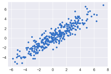
0.835496545799272
Resources and Additional Reading
Below is a list of resources