Multivariable Hierarchical Regression with Multiple Groups
An example of multivariable hierarchical linear regression with multiple categories/groups in PyMC3
Bayesian hierarchical linear regression (BHLR) is a powerful tool for machine learning and statistical analysis. Indeed, the true power of Bayesian inference over so-called frequentist statistics really hit me the first time I built a hierarchical linear regressor. In contrast to frequentist linear regression, BHLR can integrate categorical data to a much deeper degree.
Frequentist linear regression can incorporate categorical data through a so-called one-hot-encoder, essentially creating a unique offset for each category. However, suppose that not only the offset between models changes, but also the correlation and slopes. In this case, the only choice is to split the data by category and train an entirely new model for each category. This can be especially detrimental if some categories have limited or noisy data. So the choices are (1) pool all the data together and loose most of the categorical dependence or (2) split the data by category and drastically reduce the volume of data for each model resulting in increased error. Neither of the frequentist regression options are suitable.
Bayesian statistics offers a solution. BHLR models are able to account for the hierarchical structure of data. In this post, a BHLR is designed which maintains a separate slope/correlation for every category, but with the additional assumption that all slopes come from a common group distribution. This assumption allows the model to handle noisy data or lack of data within a particular category. If for example one category has limited/noisy data, then the slope will be pulled toward the mean slope across all other categories.
There is quite a bit of online material showing how to construct multivariable linear regressors and multi-categorical single metric linear regressors. However, I’m unaware of any post, tutorial, etc. showing the design of multivariable linear regressor with multiple groups. In this post, I show how to:
- Create a multivariable linear regressor with multiple categories/groups
- Train the model
- Create traceplot and summary statistics
- Run the model on test data
Import necessary modules
As in the previous example, we are again importing PyMC3 (Bayesian inference library) and Theano (deep learning library handling the back-end vector/matrix multiplications in PyMC3).
import pymc3 as pm
import numpy as np
import pandas as pd
import matplotlib.pyplot as plt
import theano
from sklearn.model_selection import train_test_split
from sklearn.metrics import r2_score
plt.style.use('seaborn-darkgrid')
Create the data set
In this example we are using fake or simulated data. This approach will allow the reader to easily manipulate the input parameters (categories, features, data points) and visualize the effect on the model. The test data set is create using the equation below:

Where, α is the intercept, Noise is the simulated noise in the data, βjk is the slope for feature j of category k, and Xijk is the data value of category k for the jth feature of the ith data point).
In this example we create two features, four categories, and a thousand data points. Of course, the number of features, categories, and data points can be easily changed through their respective variables. It is important to note the way that the matrix of slope values is created. In this example, the slope for a given feature is chosen in the feat_set variable and then categorical variation is introduced through the cat_set variable. This means that the slopes across categories have a fixed average value. Such information will be important when constructing the hierarchical model.
num_features = 2
num_hierarchy = 4
data_points = 1000

sigma_feat = 2.
sigma_cat = 0.5
feat_set = (np.random.normal(size=num_features, scale = sigma_feat).reshape(-1,1)
	       *np.ones(num_hierarchy)).T   # create an array of feature values
cat_set = np.random.normal(size=(num_hierarchy, num_features), scale = sigma_cat)
beta_set = cat_set + feat_set   # slope matrix of shape 'num_hierarchy X num_features'
alpha_set = np.random.normal(size=1) #alpha value

X = np.random.normal(size=(data_points, num_features)) #shape:'data_points X num_features'
cat = np.random.randint(0,num_hierarchy, size=data_points) #shape:'data_points'
X = np.concatenate((X,cat.reshape(-1,1)), axis=1)

y = alpha_set + (np.sum(beta_set[cat]*X[:,:-1], axis=1) +
	np.random.normal(size=(data_points))).reshape(-1,1) # shape 'data_points X 1'

X_train, X_test, y_train, y_test = train_test_split(X, y, test_size=0.25, random_state=42)
beta_set
array([[-1.25659813, -1.26705065],
       [-1.7186205 , -0.98422059],
       [-1.10539355, -0.51736205],
       [-1.33165915, -0.03235808]])
Visualize the data
Next, we can visualize the data using matplotlib via the python code below.
f, (ax1, ax2) = plt.subplots(1, 2, sharey=True)
category_1 = np.where(X_train[:,-1] == 0)
category_2 = np.where(X_train[:,-1] == 1)
category_3 = np.where(X_train[:,-1] == 2)
category_4 = np.where(X_train[:,-1] == 3)

ax1.scatter(X_train[category_1][:,0], y_train[category_1], c='r', label='1', marker = '^')
ax1.scatter(X_train[category_2][:,0], y_train[category_2], c='b', label='2', marker = '>')
ax1.scatter(X_train[category_3][:,0], y_train[category_3], c='g', label='3', marker = '<')
ax1.scatter(X_train[category_4][:,0], y_train[category_4], c='black', label='4', marker = 'o')
ax1.set_xlabel('X')
ax1.set_ylabel('Y')
ax1.set_title('Feature 1')
ax1.legend()

ax2.scatter(X_train[category_1][:,1], y_train[category_1], c='r', label='1', marker = '^')
ax2.scatter(X_train[category_2][:,1], y_train[category_2], c='b', label='2', marker = '>')
ax2.scatter(X_train[category_3][:,1], y_train[category_3], c='g', label='3', marker = '<')
ax2.scatter(X_train[category_4][:,1], y_train[category_4], c='black', label='4', marker = 'o')
ax2.set_xlabel('X')
ax2.set_title('Feature 2')
ax2.legend()
plt.show()
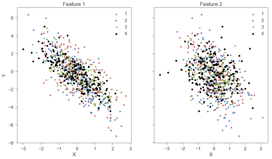
As shown in Fig. 1, feature 1 has a stronger correlation and larger slope compared to feature 2. The slopes across categories are distributed around a central value for each feature as expected from Eq. 1 above.
Create the model
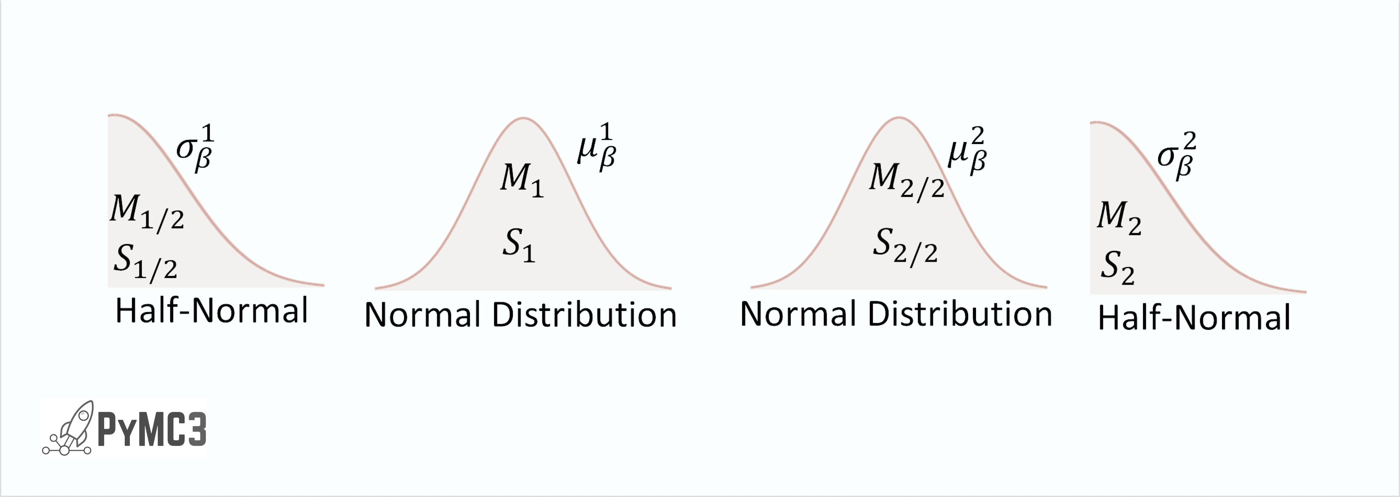
Next, we design the model. As demonstrated in “Doing Bayesian Analysis” by John Kruschke, hierarchical models are best conceptualized through illustration. Figure 2, below shows one of many possible solutions to create a linear regressor describing the data. Starting from the base we have the ith datum of category k, yi,k, which is describe by the normal distribution ylike = N(μ, σ2). The σ of ylike is described through the half-normal distribution. The mean of ylike is described by the equation:
where α is the intercept, βj,k is the slope for the jth feature and kth category, and xi,j,k is the ith value for category k and feature j. The offset, α, is described by a single common normal distribution across all categories. Note that the subscript of βj,k denotes the fact that each unique category/feature combination has its own slope. Above the equation for yest, we see that the hierarchy splits into two main branches - one for each of the two features. The slopes for each feature/category combination are described by the normal distribution where μj,k and σj,k are the predicted mean and standard deviation. At the top level of the hierarchy, the distribution of mean slopes (μj,k) for all categories of a single feature come from a common normal distribution that acts as a generic vague prior.
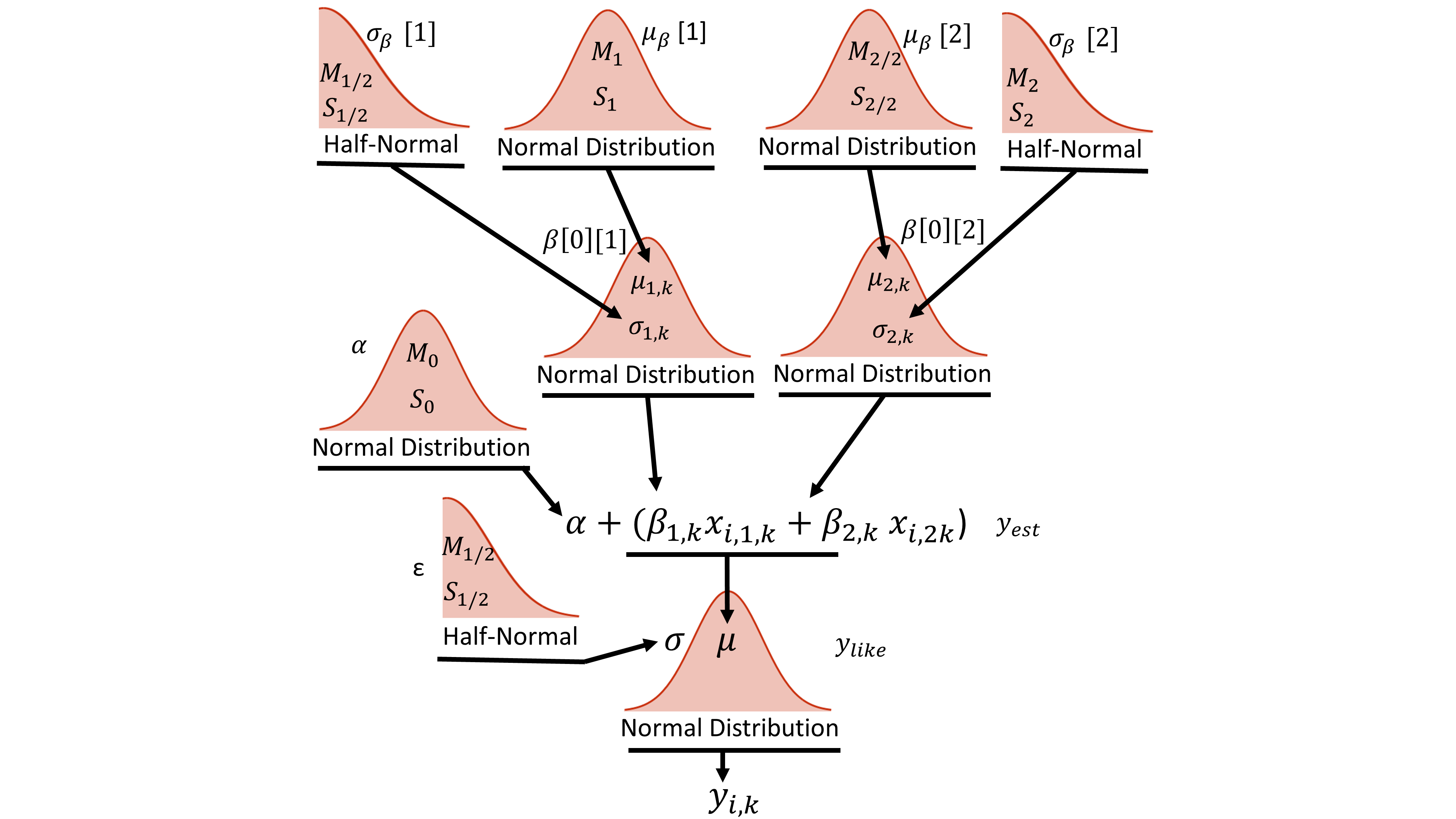
The python code describing this hierarchy is shown below. The first few lines create the theano shared variables that will allow the training data to be switched out for the test data. All of the model parameters are then specified within the with model command. The code is written from the top of the hierarchy (Fig. 2), starting with hyper-priors μβ and σβ , down to the bottom of the hierarchy (yij). It should be noted that the python code implements Eq. 2 slightly different from (although mathematically equivalent to) how the equation is shown in the hierarchy. The actual code implements yest as follows:

The variable α is represented by the single normal distribution. The variable, βj, is the jth element of the list comprehension, beta, describing the jth feature of the model. It is represented by the prior normal distributions and is of shape equal to the number of categories. For example, βj[0] would return the value for the jth feature and 0th category normal distribution). The variable Ck contains the category integer values (k) matching the category of Xijk. Thus, βj(Ck) results in an array of length equal to the total number of data points where the ith element is βjk and k is the category associated with the ith data point Xijk.
#theano shared values to make switching out train/test data easy
model_input_x = [theano.shared(X_train[:,i].reshape(-1,1)) for i in range(0,X_train.shape[1])]
model_input_cat = theano.shared(np.asarray(X_train[:,-1], dtype='int32').reshape(-1,1))
model_output = theano.shared(y_train)

with pm.Model() as hierarchical_model:
    #assume a beta mean/sigma distribution for each feature
    mu_beta = pm.Normal('mu_beta', mu=0., sd=1, shape=(num_features))
    sigma_beta = pm.HalfCauchy('sigma_beta', beta=1, shape=(num_features))

    beta = [pm.Normal('beta_'+str(i), mu=mu_beta[i],
            sd=sigma_beta[i], shape=(num_hierarchy)) for i in range(0,num_features)]

    a = pm.Normal('alpha', mu=0, sd=1, shape=(1))

    epsilon = pm.HalfCauchy('eps', beta=1) # Model error prior

    y_est = a + sum([beta_i[model_input_cat]*model_input_x[i] for i,beta_i in enumerate(beta)])

    y_ij = pm.Normal('y_like', mu=y_est, sd=epsilon, observed=model_output)
Train the model
Next, we train the model. In this example, I’m using the ADVI – Automatic Differentation Variational Inference - inference method. We could also Use the NUTS - No U-Turn Sampler. However, ADVI is much faster and will scale better at larger numbers of categories and features.
with hierarchical_model:
    inference = pm.ADVI()
    approx = pm.fit(
        n=20000,
        method=inference,
        )
advi_trace = approx.sample(7500)
Average Loss = 1,107.6: 100%|██████████████████| 20000/20000 [00:20<00:00, 957.51it/s]
Finished [100%]: Average Loss = 1,107.6
Traceplot and summary table
Once the model is trained we can plot the resulting trace plot (Fig. 3) using the python code below.
pm.traceplot(advi_trace);
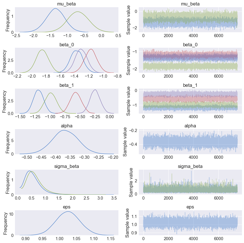
As shown in the Fig. 3, mu_beta (top panel) shows the posterior for the mean value across all categories for feature 1 (blue) and 2 (green). Panels 2 and 3 in Fig. 3, show the beta or slope posterior distributions where colors blue, green, red, and purple are the categories 1-4, respectively. The mean and standard deviation of each posterior can be displayed using the pm.summary command as shown below.
pm.summary(advi_trace)
| mean | sd | mc_error | hpd_2.5 | hpd_97.5 | |
|---|---|---|---|---|---|
| mu_beta__0 | -1.350242 | 0.267692 | 0.003006 | -1.874439 | -0.824122 |
| mu_beta__1 | -0.688267 | 0.299188 | 0.003707 | -1.277684 | -0.106423 |
| beta_0__0 | -1.372593 | 0.084724 | 0.001081 | -1.538209 | -1.207680 |
| beta_0__1 | -1.850151 | 0.085407 | 0.001001 | -2.017092 | -1.682500 |
| beta_0__2 | -1.175007 | 0.084881 | 0.000891 | -1.344568 | -1.011036 |
| beta_0__3 | -1.307591 | 0.082486 | 0.000857 | -1.470349 | -1.146790 |
| beta_1__0 | -1.192599 | 0.081709 | 0.000890 | -1.353531 | -1.036678 |
| beta_1__1 | -0.988164 | 0.094933 | 0.001124 | -1.180729 | -0.812796 |
| beta_1__2 | -0.571517 | 0.093957 | 0.001064 | -0.745138 | -0.379638 |
| beta_1__3 | -0.247489 | 0.083901 | 0.000928 | -0.411054 | -0.083529 |
| alpha__0 | -0.366627 | 0.043910 | 0.000481 | -0.454190 | -0.281669 |
| sigma_beta__0 | 0.553647 | 0.274729 | 0.003117 | 0.142453 | 1.082682 |
| sigma_beta__1 | 0.631549 | 0.286647 | 0.003291 | 0.189442 | 1.199908 |
| eps | 1.024429 | 0.034206 | 0.000437 | 0.960880 | 1.094541 |
For comparison, the orginal beta/slope matrix used to generate the data is shown below.
beta_set
array([[-1.25659813, -1.26705065],
       [-1.7186205 , -0.98422059],
       [-1.10539355, -0.51736205],
       [-1.33165915, -0.03235808]])
Test the trained model on the test data
Now that the model is trained, the training data can be replaced with the test data for validation. The data swap is performed using the theano shared variable created earlier. Then, a posterior predictive check (ppc) is used to sample the space of test x values and generate predictions. For every test datum, the ppc draws 2000 samples. Thus, the resulting ppc is an array of shape len(X_test) X 2000.
# set the shared values to the test data
[model_input_x[i].set_value(X_test[:,i].reshape(-1,1)) for i in range(0,X_test.shape[1])]
model_input_cat.set_value(np.asarray(X_test[:,-1], dtype='int32').reshape(-1,1))
model_output.set_value(y_test)

#create a posterior predictive check (ppc) to sample the space of test x values
ppc = pm.sample_ppc(
        advi_trace[2000:], # specify the trace and exclude the first 2000 samples
        model=hierarchical_model, # specify the trained model
        samples=2000) #for each point in X_test, create 2000 samples
100%|█████████████████████████████████████████| 2000/2000 [00:00<00:00, 2029.69it/s]
category_1_t = np.where(X_test[:,-1] == 0)
category_2_t = np.where(X_test[:,-1] == 1)
category_3_t = np.where(X_test[:,-1] == 2)
category_4_t = np.where(X_test[:,-1] == 3)
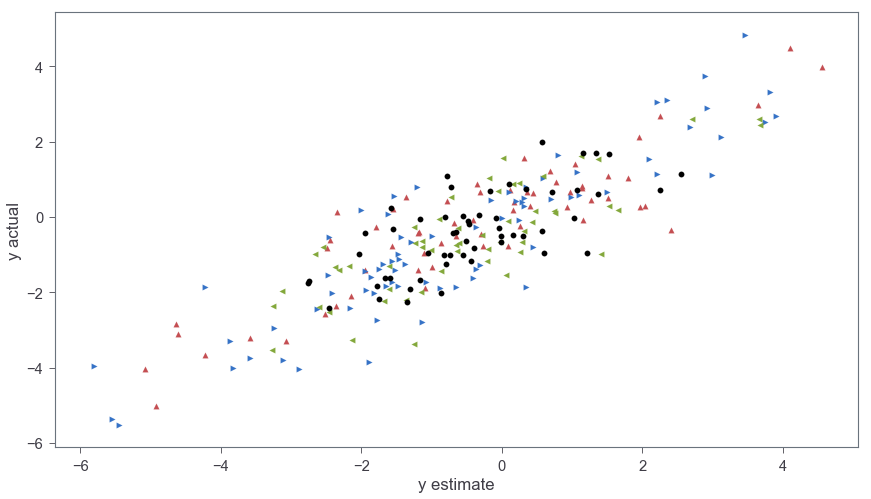
pred = ppc['y_like'].mean(axis=0) # mean of the 2000 samples for each X_test datum
plt.scatter(y_test[category_1_t], pred[category_1_t], c='r', label='1', marker = '^')
plt.scatter(y_test[category_2_t], pred[category_2_t], c='b', label='2', marker = '>')
plt.scatter(y_test[category_3_t], pred[category_3_t], c='g', label='3', marker = '<')
plt.scatter(y_test[category_4_t], pred[category_4_t], c='black', label='4', marker = 'o')
plt.xlabel('y estimate')
plt.ylabel('y actual')
plt.show()
Figure 4 show the y values from the test data as a function of the predicted values from the model. The R2 between the actual y values and the predictions (calculated via r2_score(y_test,pred)) is 0.74.
In this post, I showed how to create a hierarchical model with an arbitrary number of features and groups. Future work might involve implementing the model into a regular class that can be used seamlessly in Sklearn.